

Right, I know it was 2d. That's what I was referring to. I guess I didn't write it clearly.BTW, Vi... the DisneyToon logo WAS 2D if you are talking about the one with Mickey drawing out the unit's name?
Change in Disney's logo
Last edited by ShyViolet on May 4th, 2006, 7:46 pm, edited 1 time in total.
You can’t just have your characters announce how they feel! That makes me feel angry!


I'm hoping it's not going to be like Pixar's version of the castle. I can't stand that one. I did, however, like the CG castle in front of Chicken Little. It had so much more detail and it kept to the spirit of the original.
Although I do think the style should change from time to time, I think it should always involve the castle and some type of arch going around it. Other than that, I'd have to wait until I see it to comment on it.
Although I do think the style should change from time to time, I think it should always involve the castle and some type of arch going around it. Other than that, I'd have to wait until I see it to comment on it.
-Michael
[url=http://www.mainstreetword.com]MSW[/url]
[url=http://www.mainstreetword.com]MSW[/url]
-
Brandon Neeld
- AV Forum Member

- Posts: 376
- Joined: August 10th, 2005
- Location: Florida
- Contact:

-
PixarVixen

- AV Forum Member

- Posts: 657
- Joined: April 4th, 2006
- Location: I'd rather be way out there beyond this hidden town, Barnaby.
- Contact:
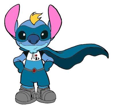
They should have Stitch fly in as Incrediboy. ^o^ Actually, Syndrome would fit him better, but I haven't drawn that yet. I included something close to that though. =P
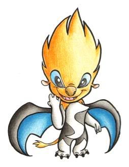
 (I drew this for Halloween last year)
~~=oP
(I drew this for Halloween last year)~~=oP
[img]http://i539.photobucket.com/albums/ff356/PixarVixen/sigs/SyndromeOlympictoss.jpg[/img]
[b]I ♥ Tony Rydinger[/b]
[size=75]avatar by Robert Iza[/size]
[b]I ♥ Tony Rydinger[/b]
[size=75]avatar by Robert Iza[/size]
-
Sullivan
- AV Forum Member
- Posts: 261
- Joined: November 15th, 2005
- Location: Beautiful Downtown Burbank
That wasn't done by circle seven. That was done by WDFA. It was a "Chicken Little version" of the castle logo.PixarVixen wrote: Also, in my opinion, the Pixar version of the Disney castle is far better than the one Circle 7 did for Chicken Little.
~~=oP[/color]
It's been a tradition of WDFA films recently that the castle logo gets a treatment in the style of the film. Home on the Range had the castle logo get branded. Atlantis had an underwater and rusty treatment, etc.
The Chicken little castle looks like a birdhouse.
-
Sullivan
- AV Forum Member
- Posts: 261
- Joined: November 15th, 2005
- Location: Beautiful Downtown Burbank
You folks are too young to remember the Paramount logo before you flew around a miniature mountain. It used to be just a flat graphic.Ben wrote:Well...we all don't know what the "new" logo will look like yet, and as I say I would assume that it will still use the castle and Walt-sig elements in a new way. So why all the worry??
BTW, remember Warner Bros famous shield logo? They didn't use it all through the 70s, instead going for their Warner Communications "broken W" look. Now that they have the shield back, they've replaced the W on the 70s films for the shield. But I don't see that as being "significant"...?
And folks old enough to remember the original star wars can recall the 20th century fox logo before you flew around it in glorious cg.
And the Warner shield never used to zoom out of a reflection of the warner studios and fly in in 3-D.
Studios create new animations of their logos sometimes.

Bit presumptuous to guess our ages! 
I remember the original logos of all of the above - and have obviously seen logos from before those times too, thanks to print restorations, television and DVD.
The Paramount logo, before the flat Gulf & Western times, was actually 3D - it was a model that used to spin around very slowly. Hardly used, but I've seen that film grace a few early color movies from them.
---------------
Yeah, I was going to ask where that Circle 7 thing came from, Vi? C7 had nothing to do with CL...!?!?