Ah yes,
the infamous Return/Revenge of the Jedi poster where the artist switched the colors of the lightsabers around!
Since everybody's so used to seeing the poster that way LFL never bothered to correct the error in any of the reprints/reproductions I've seen. I used to have a red beach towel with that image on it.
I've seen the image you posted before. Very, very old publicity still. You can also tell the sabers are airbrushed, too. Classic -- it may have been used in some of the licensed storybooks released around the time of the original films. I don't know -- I got rid of my copies of that stuff years ago.
I have to admit that sometimes I like the airbrushed/old-style rotoscoped-by-hand look of the lightsabers better than what's been done in the Prequels and Clone Wars CGI series.
*****************
I had the hardest finding a blue color that I liked AND figuring a way to light it up without getting thicker than Vader's blade!
It's a very easy effect to achieve in Photoshop... You basically draw a thin white "tube"/"blade" that tapers to a point on a separate layer over the characters. (They do something similar to this in AfterEffects for the movies now.) I usually label the label "Luke's" or "Vader's blade". You have to do the blades on separate layers... If you try to put both blades on the same layer, they'll turn out the same color. There's a whole method to the madness to getting the glow effect and colors just right but sometimes I had to go off the "usual" path and alter setting a bit.
That blue blade is definitely hard to get consistent in Photoshop. It's such a light color in the blue part of the spectrum that it's very easy to make it TOO light or TOO dark.
Also, compression affects color perception/quality.
I can see that in JPEG format the blade looks almost green! AAAARRRRRGGGGGHHHH!
****************
A big recurring mistake made today is that the digital artists constantly oversaturate the blue blade color in the restorations of the original films and the Prequels. It's just too intense -- the original blades (Obi-Wan's and Luke's first lightsaber) were softer and nowhere near as harsh as what I see in the Prequels and the "digital restorations" of the original films.
Vader's blade also tends to get rendered a bit TOO red now. It's actually closer to a hot pink in the original films -- the ones I saw in the theaters 30 years ago!
It's sad to see the LFL technicians don't care enough to get the look of the original effects RIGHT in the home video releases.
I have to go back to the 2-disc DVD edition releases with the laserdisc masters to see the proper colors for the sabers...
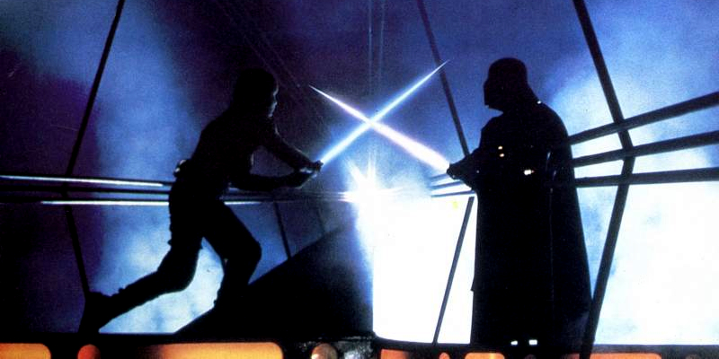
BTW,
Here is the color version of the B & W photo I posted.
I think it might be a still capture from "Empire"... There's noticeable blur and blade widening put in to indicate motion. Kinda makes the blades seem more organic IMHO. Nice look.