Tangled (formerly Rapunzel)
Disney's Rapunzel
Thanks for the bigger pics, James.
I posted this in another forum, I thought it would be of interest here:
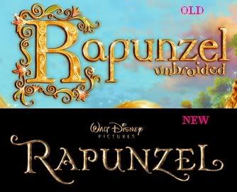
I liked Rapunzel's old logo better, without Unbraided of course. Here's the old and new compared:
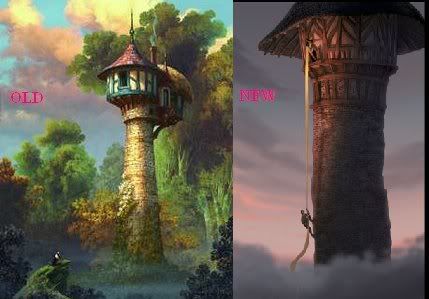
I also like the old tower much better. It was far more creative, gave Rapunzel more room atop the tower, and was cheerier. All this makes more sense for a motherly witch who wants to keep her adopted daughter happy. Remember, she was only a villain in keeping Rapunzel from seeing the outside world, and the things she did after Rapunzel disobeyed her. Also, Rapunzel's new tower looks much more...phallic, which goes along with the Freudian idea of Rapunzel being trapped in one - which is not a good idea. The old and new compared:
I posted this in another forum, I thought it would be of interest here:
I liked Rapunzel's old logo better, without Unbraided of course. Here's the old and new compared:

I also like the old tower much better. It was far more creative, gave Rapunzel more room atop the tower, and was cheerier. All this makes more sense for a motherly witch who wants to keep her adopted daughter happy. Remember, she was only a villain in keeping Rapunzel from seeing the outside world, and the things she did after Rapunzel disobeyed her. Also, Rapunzel's new tower looks much more...phallic, which goes along with the Freudian idea of Rapunzel being trapped in one - which is not a good idea. The old and new compared:

- CharlieBarkin
- AV Forum Member

- Posts: 42
- Joined: October 12th, 2007
Disney's Rapunzel
Charlie, the main difference in both images is they are darker. What, the movie can't have beauty, sunshine, happiness? WHAT is this depth you speak of? If you can't put your finger on it, all right, but consider which has more depth:
A girl is stuck in a tower so high it's in the clouds by an evil witch who won't let her near the ground at all. Everything's dark and brooding.
OR
A girl is kept by a loving enchantress in a tower that has everything she could want except for human companions and visiting other places. The atmosphere is cheery, even breathtaking, but Rapunzel still wants more...it's not enough...she needs more...depth, while she thinks she should be satisfied.
It's more interesting when you don't know you're a prisoner until you start to discover it...via prince, I guess.
The first one is concept art. Concept art is highly unlikely to be what is arrived at in the final version, when the story has come together. There will have been many reasons for any changes, which may become apparent when we see the film on the big screen.
While I don't go much for the new logo, the old one (minus Unbraided) did look like a cheap storybook title treatment, so I'm glad that's gone. Once they put some kind of elements around it, and maybe a little more color, that new logo should scrub up nicely. There's obviously a reason it bears more than a passing resemblance to Enchanted...
While I don't go much for the new logo, the old one (minus Unbraided) did look like a cheap storybook title treatment, so I'm glad that's gone. Once they put some kind of elements around it, and maybe a little more color, that new logo should scrub up nicely. There's obviously a reason it bears more than a passing resemblance to Enchanted...
Disney's Rapunzel
Ben, I'm not sure it's concept art. Please look at this link. It shows what once was a video clip that has the old title in it. If it's a computer assisted animation, that's not concept art! The original tower is also in it, so that wasn't concept art either. The second images, the new title and the new tower higher than clouds, are concept art, right? I mean you saw the new tower up close with the very flat, undeveloped prince.
The title looks too much like Enchanted's, I thought Disney learned from complaints about copying themselves! Glean Keane wanted Rapunzel not to look like any other feature!
The title looks too much like Enchanted's, I thought Disney learned from complaints about copying themselves! Glean Keane wanted Rapunzel not to look like any other feature!
Well the clips are already gone, and I have seen the one where she talks to the squirrel though. I remember when I first heard about this I remember they were trying to experiment and make it a different style than most cgi, they wanted it to be more painterly, and some reports claim they wanted it to be more traditional animation. From what I remember reading they were having trouble picking a style and story. (sounds like any animation) Maybe that was the original style, they did some tests, didn't like them or had to many problems and moved on? who knows for sure, I remember way back when they said there inspiration was the Rococo painting "The Swing," for style?
The images have very different feels to them, showing two different stories. Who knows. I think we will just have to wait until we see more images to judge right guys?
(Am I the only one who doesn't like the type/style of the titles?)
The images have very different feels to them, showing two different stories. Who knows. I think we will just have to wait until we see more images to judge right guys?
(Am I the only one who doesn't like the type/style of the titles?)
[img]http://img.photobucket.com/albums/v188/Foxtale/almostthere_signature_smaller.jpg[/img]
- eddievalient
- AV Forum Member

- Posts: 1347
- Joined: January 23rd, 2006
- Location: The Middle of Nowhere
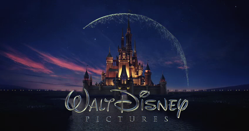
After "Enchanted", I think we're gonna see Disney using a standard fairytale font from now on. Oh well. Here's my question: Am I the only one who doesn't like the new Disney logo from the last couple of years? I loved the old one that they used for, like, 20 years because it was distinct but understated and a bit humble. The new one is too flashy, too "Look at how great we are!" It seems like an ego thing. Plus it seems like it would be harder to use the Pixar fanfare in front of their movies (if indeed they had ever planned on using it again).
The Official Lugofilm Ltd Youtube Channel: http://www.youtube.com/user/bartsimpson83
- Whippet Angel
- AV Forum Member

- Posts: 608
- Joined: January 22nd, 2007
- CharlieBarkin
- AV Forum Member

- Posts: 42
- Joined: October 12th, 2007
I've voiced much opinion on the new logo - but my main gripe is that for all the "newness", it's not so far off what they were using for the Wonderful World Of Color opening in the 1960s.
Also, I hate how the "Walt Disney" signature looks like a child modelled it - look at the "big D" in each one...which one feels stronger, more impressive to you...the original white on blue, or the wirey, and oddly flat and out of shape new one.
On the "concept art", Dusty you've going have to stop being so intensely picky. That image came from a moving test. Yes, it was moving, but it was still a test. At that stage, call it a painting, call it a pencil test, call it wireframe, or whatever...it's still all still concepts until it gets lit, perfected, and put in a final film.
I like the new logo, Charlie! I just wish they had one version for computer-assisted animation and live-action (the current one) and a hand-drawn version for traditional animation.
I see what Ben means about the "Walt Disney" logo, I think. It's a little stretchier, not as tight. It's like a silver ballon, kind of. It should be in the same shape it was before. Oh and I aslo see what he means about the concept art, it's not final so it's still a concept (but I thought it was still going to be seen in the film, like finished footage).
I see what Ben means about the "Walt Disney" logo, I think. It's a little stretchier, not as tight. It's like a silver ballon, kind of. It should be in the same shape it was before. Oh and I aslo see what he means about the concept art, it's not final so it's still a concept (but I thought it was still going to be seen in the film, like finished footage).


