
So...pretty good for the newbies...but so-so for the old timers!
Sleeping Beauty: Platinum Edition
Everything in this set - apart from the new documentary and Disneyland walkthrough - was either vintage or created for the 1995 LaserDisc set. Since much of that material made the 2003 disc, there isn't a lot "new" here. Accepted is that if you haven't seen any of this stuff before, it's pretty neat, but also gone is a lack of context from before, which helped place the features more appropriately.
So...pretty good for the newbies...but so-so for the old timers!
So...pretty good for the newbies...but so-so for the old timers!

-
GeorgeC
Heh.
You should read what they're screaming about now over at Cartoon Brew.
Apparently, they say the color on the new DVD and Blu-Ray versions of "Sleeping Beauty" is screwed up.
Gee, unless I own an original print of that film how am I gonna know the original color scheme?
I seriously give up on that site, folks. There's a point at where perfectionism veers into seriously deranged analness and beyond the point of common reason and average mental health.
Between overenthusiastic partisanship in the election and the continuing attacks on people by one the Brewmasters and the hostile atmosphere in the "forums", CB just isn't an animation news site any more. It's an advocacy site, and one that's way out of order.
...Which is why we've tried to be so careful in not letting that atmosphere creep in here, and keep our news stores separate to our commentary pieces.
Even if you had an original print of SB, it wouldn't tell you a great deal...not after years of fading and damage. Who's ranting about the color? I find it hard to see how Mr Beck can be in on it when the same accusations routinely come knocking on the Looney Tunes doors...he should well know that these restorations go back to the original art where possible, are advised on by many authorities (him included, unless I am mistaken, on the LTs) and are generally brought up to scratch as close as the original intentions as possible.
Just because we've been watching cropped, washed out third or fourth generation dupes of many of these titles, doesn't mean that's what they were intended or originally looked like to begin with.
I would agree that Peter Pan got screwed, but I think that was a final mastering error at Lowry/DTS Images as it is <I>clearly</I> missing some color information that <I>is</I> visible on the original art.
But SB? That's about as close as you can get to hanging an Eyvind Earle background on the wall, folks.


Here's the article I think George is talking about. To answer, Beck is not the one ranting about the color, it's Amid. Let's please not discuss him or for that matter the site. Doing so doesn't make us look any better. And I don't like reading it, plain and simple.
In the comments section, there are some supporting words on the restoration, such as this from Floyd Norman:
In the comments section, there are some supporting words on the restoration, such as this from Floyd Norman:
I’m not knocking the guys who did the restoration either. It’s a tough job in any case. I’m just saying that imperfect as it is — the Blue-Ray version comes pretty darn close to what I saw back in 1958. Sure, I could nit-pick every scene, but overall, it’s a pretty good job. Of course, you’ll never please everybody.
-
GeorgeC
Gee,
Who do we want to believe about Sleeping Beauty?
An older fellow who's EARNED our respect, or a smart aleck who knows nothing about anything that really matters?!?
No contest...
Floyd all the way! Way, way classier. The guy knows how to talk to people without being condescending. He's animation's Poitier.
(Yes, he got the animation equivalent of a Lifetime Achievement Oscar before he died, too.)
I've given up being concerned about exact color approximation. I wasn't alive 50 years ago when the film got made and frankly if it doesn't look like a twentieth-generation VHS dump or bad laserdisc remaster I'll be happy.
The reviews on the Blu-Ray have all been outstanding. No points and no sympathy for people who make reviews without owning the right equipment and movie in the first place!
BTW, I've never considered Sleeping Beauty one of Disney's better films. As interesting as the design and colors are, it's also a cold, impersonal film in many ways because of those very things. I've got bigger attachments to most of the Disney features made before Sleeping Beauty. The art design in those films didn't put me off like Sleeping Beauty and the early 1960s films did.
..Uh, considering Poitier was personally boardroom instrumental in why Disney never put "Song of the South" on video, could we find a better analogy, please?GeorgeC wrote:Floyd all the way! Way, way classier. The guy knows how to talk to people without being condescending. He's animation's Poitier.
(Although those of us who read other websites remember him as the guy who was posting real Disney history articles on JimHillMedia, while the Jimster was going farther off the cliff...)
Every expert on the featurette gushes how we have to appreciate "the look" of this film.BTW, I've never considered Sleeping Beauty one of Disney's better films. As interesting as the design and colors are, it's also a cold, impersonal film in many ways because of those very things. I've got bigger attachments to most of the Disney features made before Sleeping Beauty. The art design in those films didn't put me off like Sleeping Beauty and the early 1960s films did.
Okay, already: You win, guys--It's different. It's Art. But it's still The Princess Without A Personality.
-
GeorgeC
Jimster? Never heard him called that!
Did hear he was going a bit off the deep-end, but that's bound to happen with animation historians from what I've seen on more than one website. It's called "losing touch with reality" and "giving yourself more credit for power that you don't really possess." It helps to have more than one hobby. Keeps you from becoming too obsessed on one thing.
As for SOTS, I think it was more the call of the CEO than anybody on the board for why it's still being held back. Both Eisner and Iger were not eager to release the film, disclaimer or not.
Somehow, I don't think the election of Obama means we'll see it anytime soon.
Thank goodness for oversea video releases and other means!
*** Betting the film becomes public domain before an official American video release. ***


Disney Restorations
Ben, tyler, please listen to this.tyler283455 wrote:Highly Agreed.Ben wrote:It wasn't <I>that</I> bad, Mrs Tash, but just a general "lightness" to the image, which may have made it feel closer to a digitally colored master than film.
However, as we're seeing on Sleeping Beauty, there <I>is</I> an argument to say that the colors we've been seeing all these years may not have been the right ones either. <I>Apparently</I>, these new digital restorations from the negatives (starting from Bambi in 2004) are a match for the original intentions.
So if Peter Pan and Cinderella don't look as we might remember them, or <I>want</I> them to look, there's a strong chance they actually look as they <I>were</I> supposed to look, from the original three-strips.
I have found color mistakes in Cinderella's DVD version, mostly colors that I know should've been other colors. I talked to someone who worked on the menus for Disney DVDs, including recycled animation, including Cinderella's DVD. And they said they worked with people who worked on or knew about Cinderella's restoration, and that the color timing is wrong for the current restoration.
Please look at this. This is a screencap from the restored DVD. But look at the stepmother's hair. It's blue, not gray like it should be and has always been, but the same color blue as her blue shawl:
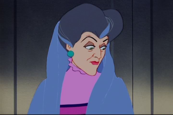
If that doesn't show you it's wrong, see that it wasn't like that before the DVD restoration:
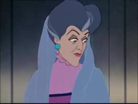
Also notice that her hair not only looks gray (as it's supposed to be), but her shawl looks more silver/gray, too. In the DVD restoration, many scenes where Cinderella's dress had been white/silver, the restoration made blue.
In the Technicolor process, the colors painted on the cels would change to a different color after the Technicolor treatment. Were certain blue painted areas supposed to be gray or silver in the finished film?
Other than that, the stepmother's hair looking the same exact blue as her shawl in the restoration makes it look like they just repainted the frame digitally, and accidentally applied the same color to her hair as her shawl. Like they did a paint fill and it filled everything that was supposed to be that gray.
The interview about Sleeping Beauty's restoration revealed they would keep the last restorations they made for a long time and use them for the next Blu-ray releases. Along with using Cinderella's messed up and wrong one, they will also be using Beauty and the Beast's changed one, not the original theatrical way it looked. This reveals they just don't care about preserving how the films were originally seen, deciding for us what the filmakers really wanted to be seen. Or, they're messing up big time.
I think Sleeping Beauty's restoration looks very accurate, though it came from this negative restoration process, but Cinderella's is wrong for sure, and yet they're still going to use it for the next release. Unless, of course, they fix it somehow without re-restoring it.

Disney Restorations
Yea, and I bet Peter Pan was messed up on purpose too! I haven't seen the DVD...I don't have a job, I'm sure someday I'll buy Peter Pan's next release, but I read about it and saw caps. Making Tinker Bell glow brighter for more attention...and making the Red Men less red to be politically correct...it's in the song, don't try to change it! I heard Cinderella was intended to look bright and modern for the new generation of kids who might think it's too old...but I don't think the blue hair was part of that, just a mistake!
Whew, I'm really glad this problem got attention, especially from you Ben!
It's hard showing some people the problem, at least at other places.
At first I wasn't sure to blame the restorers or not, but I don't think colors can change in disc encoding (which isn't done by the restorers). Either way, wrong is wring, a problem's a problem. I just don't know how they'll fix it.
And thanks for welcoming me back in the Mo-Cap thread! I'm glad to be back! I'll be in and out, here and there. Whatever stuff I like and know about to make comments on.
-
Once Upon A Dream

- AV Forum Member

- Posts: 1471
- Joined: October 7th, 2007
- Location: Unknown
Re: Disney Restorations
Ben-I started to collect DVDs then but couldn't find it.
Dusterian-TinkerBell don't need to be brighter to get more attention but the Native Americans make sense,I was planning to buy Peter Pan PE in April 2007 but I haven't got Cinderella PE then so I bought Cindy insted,and by the way-On my TV her dress looks gray (Thought only when she first gets it from the Fairy Godmother).
I can't do anything with the DMA code?.
Dusterian-TinkerBell don't need to be brighter to get more attention
I can't do anything with the DMA code?.
Last edited by Once Upon A Dream on November 18th, 2008, 9:33 am, edited 1 time in total.
[img]http://i43.tinypic.com/bfqbtk.jpg[/img]
-
Once Upon A Dream
- AV Forum Member
- Posts: 1471
- Joined: October 7th, 2007
- Location: Unknown